Personalized career site (pcs)
Eightfold.ai
User Experience | Product Design | Visual Design | Prototyping | User Testing | Information Architecture
Eightfold.ai is an AI-powered talent platform used by Fortune 500 enterprises to manage hiring and workforce intelligence. Personalized Career Site is its candidate-facing product — the experience job seekers interact with when applying to roles at Eightfold's customers.

[Before Screenshot - PCS]

[Before Screenshot - Application]
where it started
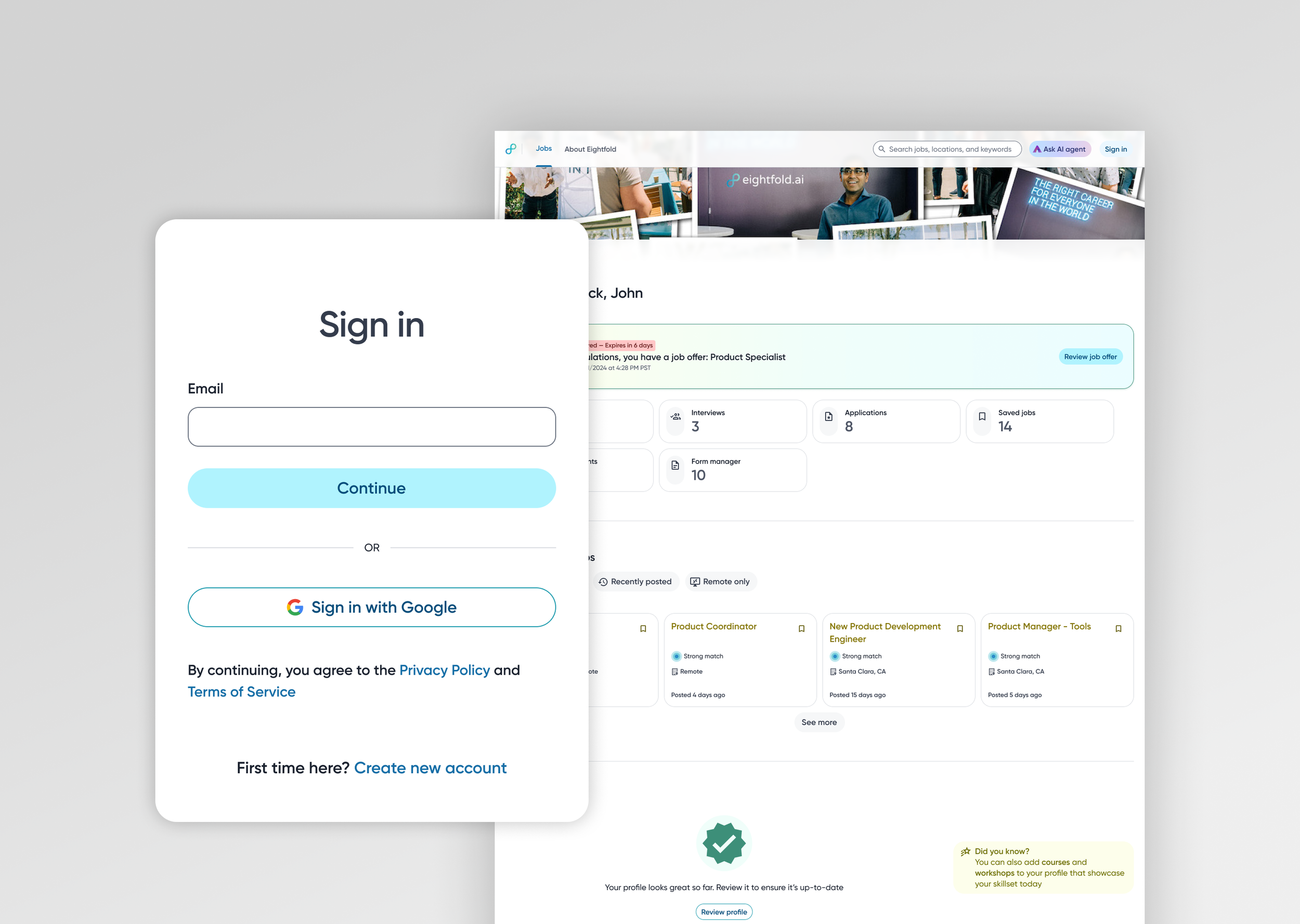
When I joined Eightfold in 2020, the Personalized Career Site was exactly what its most basic description implied: a list of jobs and a form to apply. Candidates could search openings, fill out an application, and submit it into what was effectively a black box. What happened next happened somewhere else — in their email inbox, fragmented across automated notifications they had no control over and no single place to track.
The UI reflected the product's origins as an enterprise tool built for the business, not the person using it. No design system, no shared component library, no heuristic standards. The result felt blocky, arbitrary, and dense — built to display data rather than to guide a person through one of the more consequential processes in their life. No signed-in experience. No application tracking. No mobile consideration. The product worked in the narrowest sense of the word.
the design challenge
What followed wasn't a redesign. It was five years of building new capabilities onto a platform while simultaneously trying to make the whole thing coherent — two problems that don't always want to be solved at the same time.
The first problem was accumulation. Every new feature arrived as an addition to what already existed. By year four, PCS had grown substantially but hadn't been rethought as a whole. The candidate experience reflected how the product had been built — incrementally, under different constraints — rather than how a candidate actually moved through a job search. Features felt bolted on. The product was more complete, but it didn't feel that way.
The second problem was consistency without a foundation to build it on. Every design decision had to be defended from first principles — re-argued for every surface, every sprint, every engineer who hadn't seen the previous conversation. Customer CSS customization compounded this: the same problem got solved multiple times with different answers.
the information architecture decision
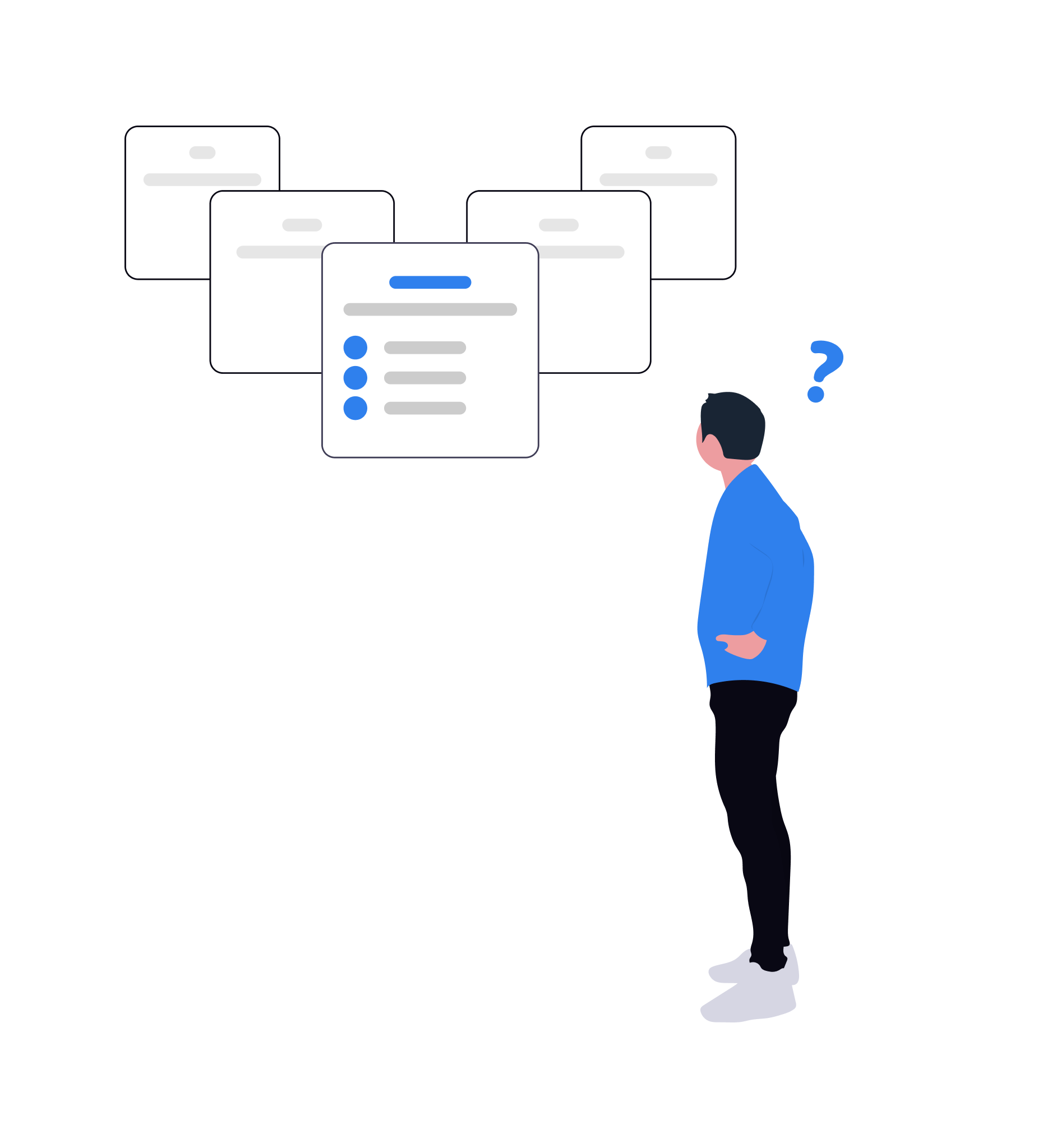
Enterprise software has a default mode: show everything, let users filter. The assumption is that more information means more value, and that the cost of complexity is worth paying for completeness. It's an assumption that works reasonably well when the person using the product is a trained professional whose job is to navigate that complexity. It works considerably less well when that person is a job seeker checking on an application between meetings.
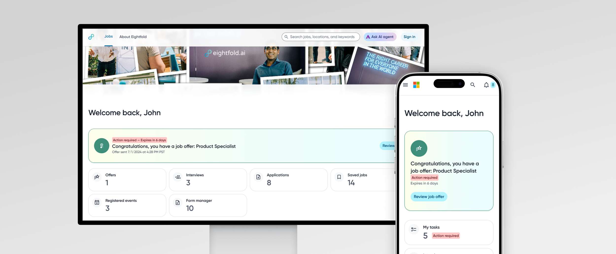
By the time the PCS redesign began in 2024, the signed-in experience I had designed over the previous three years was already in place — authentication, onboarding, application tracking, and the core entity pages. What hadn't been done was stepping back and asking how all of it fit together as a whole. The redesign was the opportunity to do that. And the question I started with was one that consumer product designers ask more often than enterprise ones: of everything this product now contains, what are the handful of things a candidate actually needs to see? Not everything the system could surface — the things that matter, at the moment they matter.
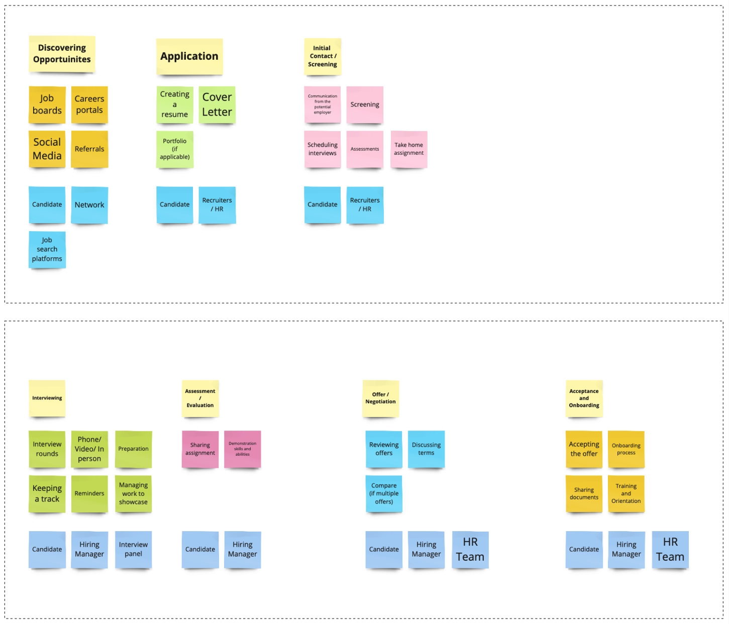
Whiteboarding / Affinity mapping
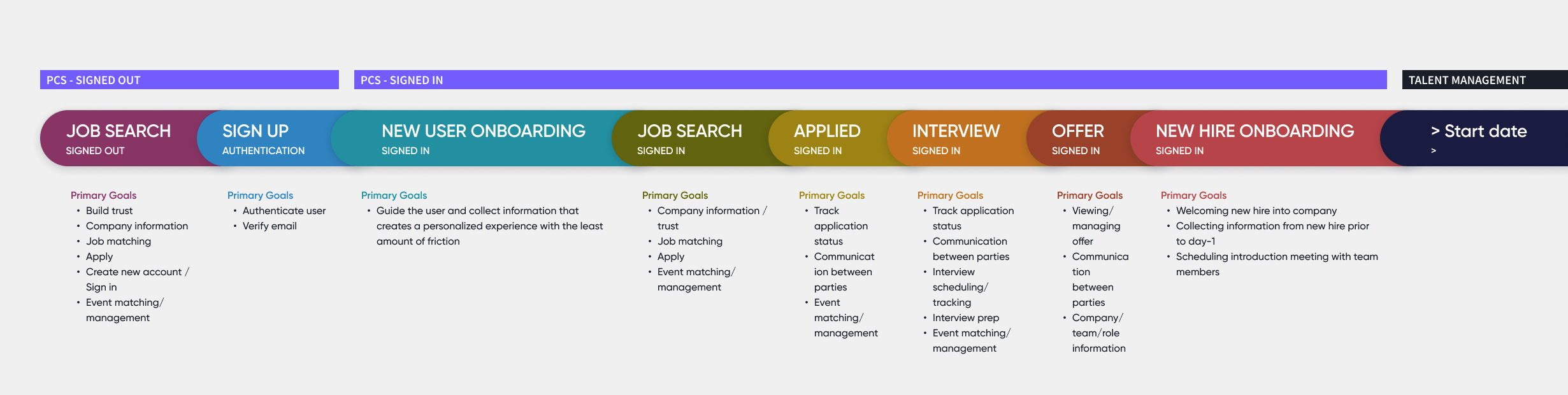
The answer became the organizing framework for the entire experience. I identified five first-class entities that represented the meaningful stages of a candidate's journey with an employer: Jobs, Applications, Interviews, Offers, and Preboarding. These weren't arbitrary categories — they mapped directly to where a candidate's attention and action were needed at each point in the process. Everything else was secondary.
The dashboard became a matrix of homepage tiles, one per entity, each surfacing only the highest-signal metric for that category. Not a list of every open application with every available data point — a clear, scannable answer to the question a candidate was actually asking when they opened the product: where do things stand? Clicking a tile opened the full entity view. Detail revealed itself on intent, not by default.
Two entities — Offers and Preboarding — were hidden until they became relevant. Most candidates using the product would never reach an offer stage in any given session. Surfacing those tiles unconditionally would have added visual weight and implied a complexity that most users would never encounter. Instead, they appeared conditionally when a candidate crossed those thresholds, and a banner at the top of the dashboard prompted action when something new required their attention — an offer to review, a preboarding package to complete.

Single image showing various mobile designs
mobile first
Eightfold's product DNA is enterprise — desktop users, wide viewports, multi-column layouts. That assumption works for a recruiter at a desk. It doesn't work for a candidate checking on an application from their phone.
Making PCS mobile-first meant starting from mobile constraints and expanding outward, not the other way around. The distinction matters: "translated to mobile" and "designed for mobile first" produce fundamentally different outcomes. Ranking every element by importance before the layout exists — which mobile-first requires — was the same discipline that shaped the IA decision. It also surfaced a persistent tension throughout the product's development: customer CSS customization could undo any mobile-first decision. Getting guardrails in place was an ongoing negotiation, not a one-time call.
Feature Expansion
The five years between the initial job board and the 2024 redesign were spent building the product that the redesign then unified. Each addition below was solving a specific gap in the candidate experience.
CANDIDATE EXPERIENCE
SIGNED-IN EXPERIENCE
Authentication gave the platform memory — applications, saved jobs, interview status, offer decisions, and preboarding materials in one place. The product went from somewhere you went to apply to somewhere you went to stay current.
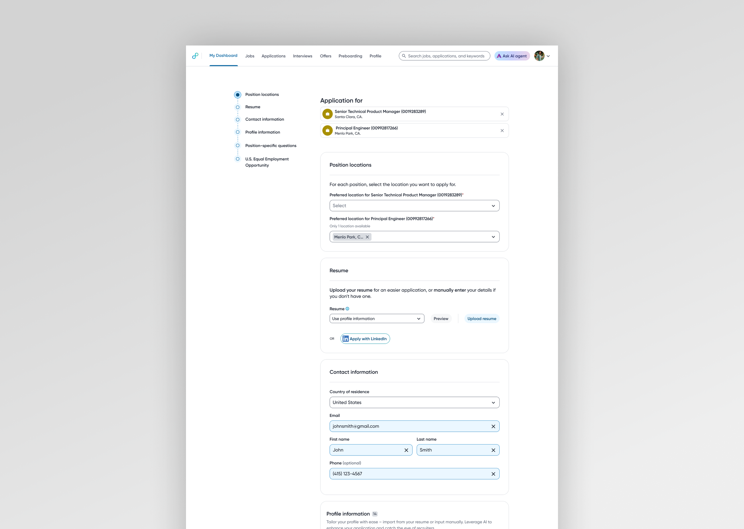
NEW APPLICATION FLOW
The original was a single-page form, identical for every company, with no conditional logic, no profile integration, and no mobile consideration. The redesigned flow is multi-stage — collecting information progressively, surfacing only what's relevant to each applicant at each stage.
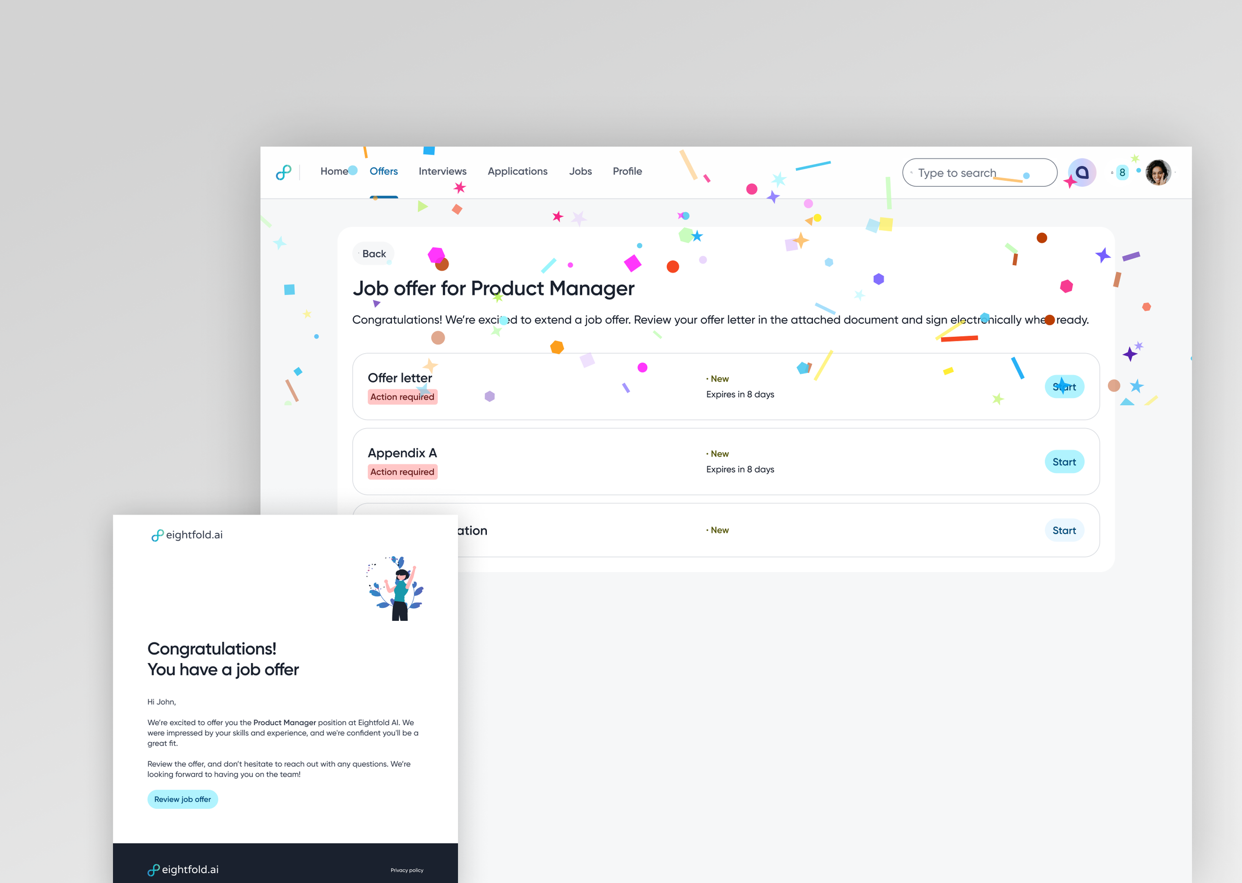
OFFER REVIEW AND SIGNING
Before this, offer communication happened entirely off-platform. The solution supported multiple document types, multiple signing methods, and full package management — bringing a previously fragmented experience into one place.

PREBOARDING
The gap between offer acceptance and day one is where engagement peaks then falls off. Preboarding fills that gap — collecting paperwork and company information while a new hire's attention and excitement are highest, so day one is orientation rather than administration.

AI CANDIDATE AGENT
Text-first with a voice option — a deliberate departure from the recruiter-side AI the platform already supported. The agent handles job search, application guidance, and platform navigation as a co-experience alongside the main interface, with a split-panel design.

EMAIL COMMUNICATIONS
Replaced plain-text, unbranded emails with a template system built to best practices — bulletproof buttons, mobile-optimized width, customer branding support, legal compliance.

OCTUPLE DESIGN SYSTEM
Covered in its own section — but the candidate experience redesign was the project where full Octuple integration finally became the default rather than the aspiration.
NON-CANDIDATE EXPERIENCE

FORM BUILDER
Replaced an archaic admin field configuration with a modern Google Forms-style interface — conditional logic, validation rules, a reusable question bank, and a layout that lets admins see the form they're building. Advocated for this before it hit the roadmap.

PREBOARDING FLOW MANAGEMENT (SPEC)
A visual flow map for HR operations and cross-functional teams to build and manage preboarding packages — showing progress, blockers, dependencies, and outstanding requirements across assignees and workflow stages.
Designing Through a System Transition
Octuple is Eightfold's design system — a shared component library built to bring consistency across all products. It represented exactly the foundation PCS had been missing since day one. The challenge wasn't understanding its value. The challenge was getting there from where we were.
In the early years, designing for PCS meant working from old Sketch files, rebuilding pages from screenshots, and constructing components from scratch. When Octuple began to formalize, I made a deliberate call: any net-new design would be built fully in Octuple regardless of what surrounded it. The old system would deprecate naturally. This created a transitional period of visual inconsistency — manageable, and honest about the constraints — rather than freezing the team between two states.
The 2024 redesign was the inflection point. Rebuilding PCS from the ground up meant there was no longer any reason to reference the old system. Every surface was new. Every component was Octuple. I contributed alongside the dedicated design system designer and the broader team — providing input that shaped components, advocating for adoption, and making sure PCS fully reflected the system.

Career Navigator
Career Navigator started from a recognition that career planning and job seeking are different activities that benefit from different tools. The existing career planner gave you a destination without a map. The redesign was a visual, dynamic pathing tool built around a node-based graph — your current role as the starting point, recommended paths branching toward your goal.
By default, start and end points show as full role cards, with intermediate nodes truncated if space requires it. Clicking expands the full path. Each role card links to a detail page showing similar role names, open jobs, supporting courses, and adjacent paths — everything contextually relevant to that role.
The tool was designed for three mindsets: the builder constructing a path toward a goal, the grower advancing along their current trajectory, and the switcher considering a change. Built as a self-contained, portable design — it ultimately shipped with Talent Management rather than PCS, but was always product-agnostic by intent.
One thing I'd do differently: mobile needed to be designed in parallel, not as a later phase. A canvas-based graph that works at wide viewport becomes a different problem at mobile width. My instinct now would be a vertical card stack expanding downward rather than rightward — preserving the sense of progression without fighting the viewport.
Outcomes & Reflection
PCS today is the candidate-facing product for Eightfold.ai, used by Fortune 500 enterprises across technology, financial services, healthcare, and manufacturing. What it became over five years is night and day from what it was — a job list and a form is now a complete candidate lifecycle, from discovering a role through interviews, into an offer, and all the way to day one.
What I'm most proud of isn't any single feature. It's the consistency of the design philosophy across the full arc of the work. In an enterprise product context where the instinct is always to add, to surface, to make visible — I kept pushing in the other direction. Fewer things on the primary surface. Progressive disclosure over data completeness. Consumer patterns applied where they genuinely served the user, not just where they looked more modern. The product got more capable every year, but the experience didn't get more complicated. That was deliberate, and it required defending that position repeatedly.
What I'd do differently is harder to answer honestly than it sounds. The tension between design quality and engineering velocity never fully resolved — there was always a delta between what was designed and what shipped, between what I could see needed fixing and what the team had capacity to address. I built a UAT process to close part of that gap, and eventually locked Figma files as source of truth for build sign-off. But there were enhancements, content design improvements, and component refinements that never got scheduled, and some of them still bother me. That's the reality of designing inside a resource-constrained organization. You learn to distinguish between what you can control and what you can influence, and you get better at making the case for the things that matter most.
Five years on one product teaches you things no sprint can. You learn which decisions age well and which ones create debt. You learn how to design for a user whose relationship with your product changes over time — from job seeker to applicant to candidate to new hire. And you learn that coherence, at scale, over time, is its own kind of design problem. One that doesn't show up in a single case study image but accumulates across every interaction a candidate has with a product that actually works the way it's supposed to.