Brand Web Redesign
FICO
Visual Design | Branding | Information Architecture | Template Systems | Cross Platform
myFICO was in dire need of a fresh identity — their site and brand was stale and yearned for a breath of fresh air to stand out in the market. All of the other companies in the credit space followed the same financial company template — formal, dark, uninviting and cold. I chose a different approach that set myFICO apart from the rest by a warmer color palette, legible typography, iconography, detailed visual elements and tone.

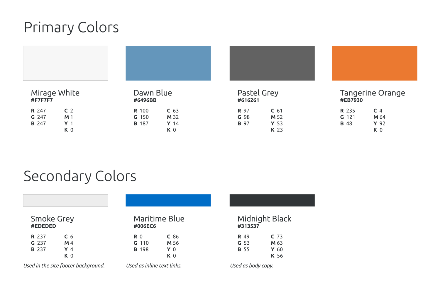
Color palette
The credit industry shared the same aesthetics as financial services and institutions — Primary and vivid colors. I wanted to set myFICO apart from our competitors/partners and chose an complementary set of off-tone and slightly muted colors. I still wanted to retain a primary blue, and accented the design with an energetic orange.

LANDING & HOME PAGES
Delivering specialized landing and home pages allowed us to more accurately message users based on their goals. Whether they are new user looking for credit information or frequent users on top of their FICO Scores, the right messaging and call to actions are essential when they arrive on myFICO.
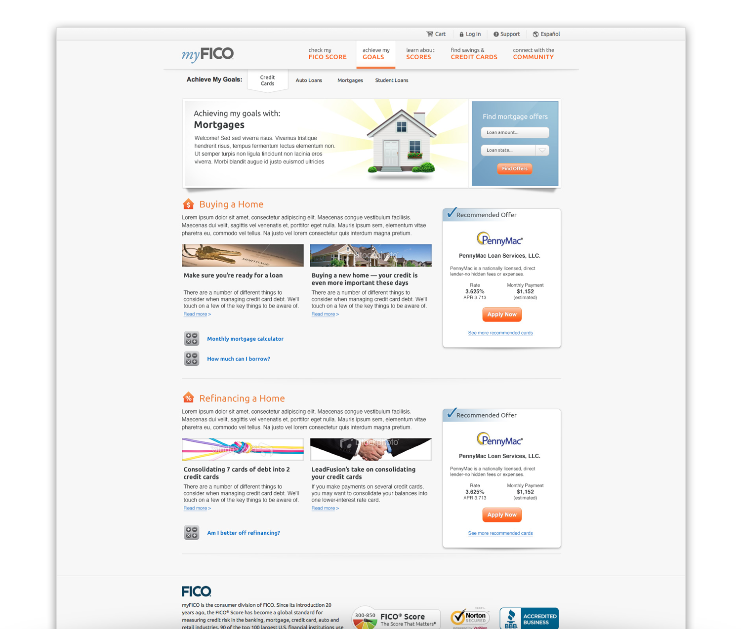
ACHIEVE MY GOALS
The Achieve My Goals section bridged the gap between credit education and the FICO products. We approached this section from a credit goal perspective — mortgages, auto loans, credit cards and student loans. Within each credit goal, we provide information and resources to guide the user through that specific goal.
For example, within mortgages, we would provide information for new home buyers and mortgage refinance. For new home buyers, we would deliver information on getting ready for a mortgage, display calculators, relevant articles, blogs and mortgage rate offers. This section was the first section to integrate many different content types into a goal based narrative.
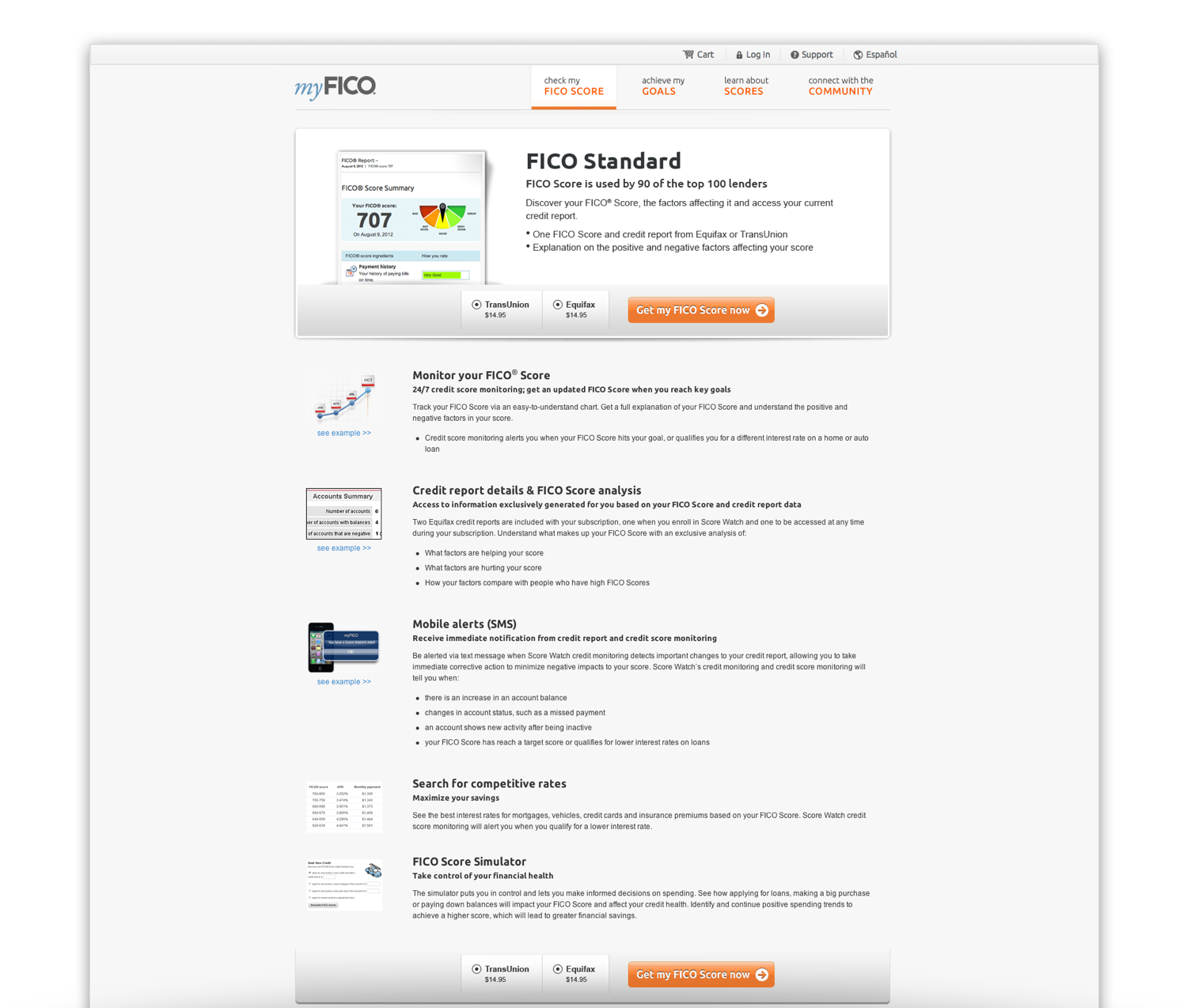
PRODUCT DETAIL PAGES
The FICO product information pages were essential for user acquisition. Unfortunately, our products at the time, were all created without any brand continuity and the differences were very nuanced. They were created at different times, with different bureaus and contracts — in other words, our various products were confusing to chose between. This problem was eventually fixed throughout the years when we refined the products to reflect a product family. Focusing on the important and differentiating information for each product was key in helping the user find the product for their needs. Highlighting high-level product descriptions, purchase options and features were our primary goals.