
Personalized career site (pcs)
Eightfold.ai
User Experience | Product Design | Visual Design | Prototyping | User Testing | Information Architecture
Eightfold.ai is an AI-powered talent platform used by Fortune 500 enterprises to manage hiring and workforce intelligence. Personalized Career Site is its candidate-facing product — the experience job seekers interact with when applying to roles at Eightfold's customers.

where it started
When I joined Eightfold in 2020, the Personalized Career Site was exactly what its most basic description implied: a list of jobs and a form to apply. Candidates could search openings, fill out an application, and submit it into what was effectively a black box. What happened next happened somewhere else — in their email inbox, fragmented across automated notifications they had no control over and no single place to track.
The UI reflected the product's origins as an enterprise tool built for the business, not the person using it. No design system, no shared component library, no heuristic standards. Each product at Eightfold had developed its own similar-but-incompatible design language, making consistency across surfaces aspirational at best. The result felt blocky, arbitrary, and dense — built to display data rather than to guide a person through one of the more consequential processes in their life.
There was no signed-in experience. No application tracking. No notifications. No mobile consideration. Custom branding required manual CSS injections by engineers. No content design guidelines, no accessibility standards, no usability studies. The product worked in the narrowest sense of the word.
That was the starting point.
the design challenge
What followed wasn't a redesign. It was five years of building new capabilities onto a platform while simultaneously trying to make the whole thing coherent — two problems that don't always want to be solved at the same time.
The first problem was accumulation. Every new feature arrived as an addition to what already existed. By year four, PCS had grown substantially but hadn't been rethought as a whole. The candidate experience reflected how the product had been built — incrementally, by different teams, under different constraints — rather than how a candidate actually moved through a job search. Features felt bolted on. Pages borrowed from the enterprise product carried desktop information architecture that didn't translate to the people actually using them. The product was more complete, but it didn't feel that way.
The second problem was consistency without a foundation to build it on. In the early years, every design decision had to be defended from first principles. Should this be an accordion or a list? How does this pattern translate to mobile? What does this component do on a narrow viewport? Without a shared design language, these weren't settled questions — they had to be re-argued for every surface, every sprint, every engineer who hadn't seen the previous conversation. Customer CSS customization compounded this: solutions that worked in one context broke in another, and the same problem got solved multiple times with different answers.
This was the environment in which every feature in this case study was designed.
the information architecture decision
Enterprise software has a default mode: show everything, let users filter. The assumption is that more information means more value, and that the cost of complexity is worth paying for completeness. It's an assumption that works reasonably well when the person using the product is a trained professional whose job is to navigate that complexity. It works considerably less well when that person is a job seeker checking on an application between meetings.
By the time the PCS redesign began in 2024, the signed-in experience I had designed over the previous three years was already in place — authentication, onboarding, application tracking, and the core entity pages. What hadn't been done was stepping back and asking how all of it fit together as a whole. The redesign was the opportunity to do that. And the question I started with was one that consumer product designers ask more often than enterprise ones: of everything this product now contains, what are the handful of things a candidate actually needs to see? Not everything the system could surface — the things that matter, at the moment they matter.
The answer became the organizing framework for the entire experience. I identified five first-class entities that represented the meaningful stages of a candidate's journey with an employer: Jobs, Applications, Interviews, Offers, and Preboarding. These weren't arbitrary categories — they mapped directly to where a candidate's attention and action were needed at each point in the process. Everything else was secondary.
The dashboard became a matrix of homepage tiles, one per entity, each surfacing only the highest-signal metric for that category. Not a list of every open application with every available data point — a clear, scannable answer to the question a candidate was actually asking when they opened the product: where do things stand? Clicking a tile opened the full entity view. Detail revealed itself on intent, not by default.
Two entities — Offers and Preboarding — were hidden until they became relevant. Most candidates using the product would never reach an offer stage in any given session. Surfacing those tiles unconditionally would have added visual weight and implied a complexity that most users would never encounter. Instead, they appeared conditionally when a candidate crossed those thresholds, and a banner at the top of the dashboard prompted action when something new required their attention — an offer to review, a preboarding package to complete.
mobile first

Eightfold's product DNA is enterprise. The default assumption across most of the platform is a desktop user, a wide viewport, and information architecture that reflects that — multi-column layouts, dense tables, modal overlays with padding to spare. That assumption works for a recruiter at a desk. It doesn't work for a candidate checking on an application from their phone.
Making PCS mobile-first wasn't a directive — it came from understanding who was actually using the product and where. Job seekers don't sit at desktops to track applications. They check between meetings, on commutes, in the five minutes before something else starts. Designing for that reality meant starting from mobile constraints and expanding outward, not the other way around.
The distinction matters more than it sounds. "Translated to mobile" and "designed for mobile first" produce fundamentally different outcomes. When you translate a desktop layout to mobile, you're making the best of a structure that wasn't built for a single column. The two-column pages common across Eightfold's enterprise products illustrate the problem directly: on desktop, the most important content sits at the top of both columns simultaneously. Collapse that to mobile and you have to choose — does the secondary column go above or below the primary? Either way, something important gets buried. The only way to avoid that tradeoff is to rank every element by importance before the layout exists, which is exactly what mobile-first design requires.
This principle extended to interaction patterns as well. Modals designed for desktop — floating panels with generous surrounding padding — become cramped and awkward on a narrow viewport where horizontal space is the scarcest resource. Consumer products solve this with bottom sheets, which use the vertical axis instead. Tables designed for wide screens become unreadable at mobile width and need to be reconceived as card lists with drilldown behavior. Long forms that feel manageable on desktop feel overwhelming on a small screen — consumer apps have largely solved this by breaking data collection into focused single-question steps, a pattern I advocated for internally against the instinct that fewer screens meant simpler.
The mobile-first approach also surfaced a persistent tension that predated the redesign: customization. PCS allowed customers significant latitude to configure their experience, which created a scaling problem from early on. Every design decision made with mobile-first principles in mind could be undone by a customer CSS override that assumed desktop. Getting guardrails in place — preserving the system's structural integrity while still allowing meaningful customization — was an ongoing negotiation throughout the product's development.
Feature Expansion
The five years between the initial job board and the 2024 redesign were spent building the product that the redesign then unified. What follows is the inventory of that work — not a feature list, but a record of what each addition was actually solving for.
candidate experience
Signed-in experience. Authentication transformed PCS from a transactional endpoint into an ongoing relationship. Suddenly the platform had memory — a candidate's applications, saved jobs, interview status, draft submissions, additional information requests, offer decisions, and preboarding materials all lived in one place. The product went from somewhere you went to apply to somewhere you went to stay current.
New application flow. The original application was a single-page form, identical in structure for every company, requiring engineering cycles for any revision, with no conditional logic, no question bank, no validation rules, no profile integration, and no mobile consideration. The redesigned flow is multi-stage — broken into phases that collect information progressively, surfacing only what's relevant to a given applicant at a given stage. This reduced the lowest-common-denominator problem of single-page applications that had to ask everything of everyone.
Offer review and signing. Before this feature, offer communication happened entirely off-platform — through the ATS and the candidate's inbox. The design challenge here was breadth: companies handle offers differently. The solution supported multiple document types (on-platform forms, uploaded PDFs, DocuSign integration), multiple signing methods (download-sign-reupload, type-to-sign, third-party e-signature), and full package management for multi-document offers. Status tracking, notifications, and post-decision document management were all part of the scope.
Preboarding. The gap between offer acceptance and day one is where engagement peaks and then typically falls off a cliff. Preboarding was designed to fill that gap — collecting paperwork, disclosures, and company information during the window when a new hire's attention and excitement are highest, so that day one is orientation rather than administration. It also extended PCS's lifecycle all the way to the point of handoff to Talent Management, making the platform genuinely end-to-end.
AI candidate agent. The agent I designed for PCS was text-first with a voice option — a deliberate departure from the video and voice AI interviews the platform already supported for recruiters. The reasoning was straightforward: a candidate in the job-seeking process isn't always in a position to commit to a video experience. Text meets them where they are. The agent handles job search and recommendations, application guidance, general company and role questions, and navigation within the signed-in experience — preboarding prompts, offer questions, and status checks. It operates as a co-experience alongside the main interface, with a split-panel design that lets the agent navigate the platform alongside the candidate. The interaction model and consumer-facing implementation were my design — distinct enough from the recruiter-side AI work to constitute a separate design problem.
Email communications. The baseline before this work was plain-text emails with minimal branding and no structural standards — no customer branding integration, no legal considerations like unsubscribe, no mobile optimization. The template system I designed followed email best practices throughout: bulletproof buttons, optimal width for both mobile and desktop clients, structured sections, customer branding support, and coverage across multiple products and personas.
Octuple design system. Covered in its own section — but the candidate experience redesign was the project where full Octuple integration finally became the default rather than the aspiration.
Non-Candidate Experience
Form builder. The previous form builder lived inside the admin tool as a series of nested fields that expanded endlessly within the page — technically functional, practically unusable without engineering involvement, and completely at odds with the platform's push toward self-service. The redesigned form builder follows familiar modern UX patterns — closer to Google Forms in structure and interaction — with conditional logic, custom validation rules, a reusable question bank, and a layout that lets admins actually see the form they're building. I had been advocating for this before it reached the roadmap; the self-service direction gave it the business case it needed.
Preboarding flow management. The candidate preboarding experience needed an administrative counterpart — a tool for HR operations, admins, and cross-functional teams (IT, legal, direct managers) to build and manage preboarding packages. Each package is a set of documents and tasks, each with its own assignees, prerequisites, and workflow stages. A background check might route from candidate to recruiter to a third-party provider. A device request might go from candidate to IT. The visual flow map I designed gave administrators a way to see the entire process at once — progress, blockers, dependencies, and outstanding requirements — rather than managing it through email and spreadsheets.
Designing Through a System Transition
Octuple is Eightfold's design system — a shared component library and design language built to bring consistency across all of the platform's products. Clean, accessible, and comprehensive, it represented exactly the kind of foundation that PCS had been missing since day one. The challenge wasn't understanding its value. The challenge was getting there from where we were.
In the early years, designing for PCS meant working from old Sketch files that had been partially migrated to Figma, rebuilding pages from screenshots where design files didn't exist, and constructing components from scratch because shared libraries weren't yet available. Every page was a one-off. Nothing was reusable in any meaningful sense. It wasn't a sustainable way to design and it wasn't a sustainable way to build.
When Octuple began to formalize as a system, the question became how to adopt it without stopping everything else. A wholesale conversion of the product wasn't on the table — engineering resources were focused on feature delivery, not design debt. So I made a different call: any net-new design would be built fully in Octuple, regardless of what surrounded it. No new work would add to the old system. The old system would be left to deprecate naturally as features were redesigned or replaced.
This created a transitional period where a candidate moving through a flow might encounter pages that looked noticeably different from each other — newer surfaces in Octuple, older ones still on the legacy system. In cases where the contrast was significant enough to break the experience, I designed the new work in old system components as well, to maintain continuity. It wasn't elegant, but it was honest about the constraints and it kept the team moving forward rather than frozen between two states.
The practical argument that landed with engineering and product wasn't aesthetic — it was operational. Octuple meant existing patterns, documented behavior, shared components that engineers had already built. Designing in Octuple reduced the surface area for interpretation errors. It meant fewer conversations re-litigating basic UX decisions because the system had already made them. It meant new designers could onboard faster. Over time, the case made itself.
The 2024 redesign was the inflection point. Rebuilding PCS from the ground up — rethinking the information architecture, the page templates, the interaction patterns — meant there was no longer any reason to reference the old system. Every surface was new. Every component was Octuple. The years of parallel design finally resolved into a single design language across the product.
I contributed to Octuple alongside the dedicated design system designer and the broader UX team — providing input that shaped components, establishing patterns specific to the PCS use case, and acting as one of the primary advocates for adoption within the product. The design system itself was a collaborative effort. What I owned was making sure PCS reflected it.
Career Navigator
Career Navigator started as a recognition that career planning and job seeking, while related, are different activities that benefit from different tools. The existing career planner was functional in the narrowest sense — choose a target role, receive a list of steps. It didn't help you explore. It didn't show you what was adjacent to your current path, or what the intermediate roles between where you are and where you want to be actually looked like. It gave you a destination without a map.
The redesign was a visual, dynamic career pathing tool built around a node-based graph. Your current role is the starting point. The system generates a set of recommended paths based on your profile, career interests, and trajectory — branching routes through the roles that connect where you are to where you're going. The graph is designed to be explored, not just read.
By default, the start and end points are shown as full role cards, with intermediate nodes truncated if space requires it. Clicking a truncated node expands the full path, revealing each intermediate role as a card — even if that means the path extends off the right edge of the screen. The design prioritizes legibility of the full journey over fitting neatly into a viewport. When a role card is clicked, it opens a dedicated role detail page showing the role's context: similar role names in the industry, open jobs at that role level, courses that build toward it, the paths that lead to it, and the paths that lead from it.
The tool was designed to serve three distinct mindsets: the builder, who is actively constructing a career path toward a specific goal; the grower, who wants to advance along their current trajectory; and the switcher, who has a path but is considering a change. The branching graph structure accommodates all three without requiring the product to know in advance which mode a user is in.
One element I designed for the role detail page that didn't make it into the MVP was AI-generated role descriptions. The scaling problem with a tool that covers the full range of roles across any company's structure is curation — maintaining accurate, useful descriptions for every possible role isn't feasible manually. My solution was to generate that content dynamically using LLM queries, producing role context on demand rather than from a curated database. The infrastructure for this wasn't in place for the initial release, but the design was built to accommodate it when it was.
Career Navigator was built as a self-contained, portable design — a feature that could integrate naturally into PCS, Talent Management, or Workforce Exchange depending on the product context and customer need. The platform-level design system made that portability real: shared components, shared navigation, shared page templates meant the feature could be placed without redesign. It ultimately shipped as part of Talent Management rather than PCS, where career building over time is a more central use case than transactional job seeking. But the design was always product-agnostic by intent.
One thing I'd do differently: the mobile experience for Career Navigator needed to be designed in parallel with desktop, not treated as a later phase. A canvas-based graph that works beautifully at wide viewport becomes a different design problem entirely at mobile width. The mental model — here is where you are, here is where you're going, here is the path between them — is harder to preserve when the canvas has to compress or scroll horizontally. My instinct now would be to approach mobile as a vertical card stack that expands the career path downward rather than rightward, preserving the sense of progression without requiring a canvas that fights the viewport.
Outcomes & Reflection
PCS today is the candidate-facing product for Eightfold.ai — a platform used by enterprises globally to manage talent acquisition and workforce intelligence. Eightfold's customers include Fortune 500 companies across technology, financial services, healthcare, and manufacturing, organizations that collectively process hiring at a scale where the quality of the candidate experience has measurable business consequences.
What the product became over five years is night and day from what it was. A job list and a form is now a complete candidate lifecycle — from discovering a role to tracking an application, through interviews, into an offer, and all the way to day one. The experience is mobile-first, built on a shared design system, and increasingly AI-augmented at the points where automation genuinely serves the candidate rather than the platform.
What I'm most proud of isn't any single feature. It's the consistency of the design philosophy across the full arc of the work. In an enterprise product context where the instinct is always to add, to surface, to make visible — I kept pushing in the other direction. Fewer things on the primary surface. Progressive disclosure over data completeness. Consumer patterns applied where they genuinely served the user, not just where they looked more modern. The product got more capable every year, but the experience didn't get more complicated. That was deliberate, and it required defending that position repeatedly.
What I'd do differently is harder to answer honestly than it sounds. The tension between design quality and engineering velocity never fully resolved — there was always a delta between what was designed and what shipped, between what I could see needed fixing and what the team had capacity to address. I built a UAT process to close part of that gap, and eventually locked Figma files as source of truth for build sign-off. But there were enhancements, content design improvements, and component refinements that never got scheduled, and some of them still bother me. That's the reality of designing inside a resource-constrained organization. You learn to distinguish between what you can control and what you can influence, and you get better at making the case for the things that matter most.
Five years on one product teaches you things no sprint can. You learn which decisions age well and which ones create debt. You learn how to design for a user whose relationship with your product changes over time — from job seeker to applicant to candidate to new hire. And you learn that coherence, at scale, over time, is its own kind of design problem. One that doesn't show up in a single case study image but accumulates across every interaction a candidate has with a product that actually works the way it's supposed to.

Creating prototypes were essential for getting real hands on the product. I utilize InVision and Pixate to build the prototypes. InVision is a fast way to get designs on the device and simple interaction across a wide array of pages. Unfortunately, InVision lacks in dynamic micro interactions and animations. With Pixate, I was able to visualize animations and partial-page usability and really brought the app to life.


I created a 120+ page documentation consisting of branding, components, asset libraries, page flows, designs, styles, & interaction designs. This document provides a clear explanation of the design to the team. This helps designers with consistency, engineers with implementation, quality assurance with verification and the team as a whole better understand the product.
Finally, I worked hand in hand with developers — outlining the design and features, and supporting them with any questions that arose during the engineering stage.
The Birth of the Home Screen
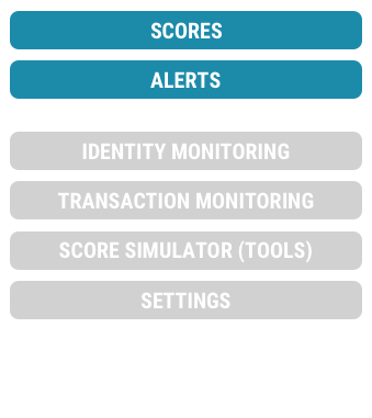
During the early wireframes, we discovered that the Scores screen was not an ideal page to land the user on when logging in. Up to this point in time, users would always be presented with their Scores data in context of the Scores section.
With the introduction of the Identity Monitoring and Transaction monitoring product, FICO was no longer just credit data. I designed a Welcome screen that personalized the experience for the user. Display data pertaining to the user’s products, account and information. This new screen would catch the user up on changes to their account since last login and recommendations on actions to take. We created a matrix of all possible elements that we would want to display across the FICO product suite and prioritized the display of them based on importance. Only data that was relevant to the user would show.


Not only did this page have customized information, but also greeted the user and introduced a humanistic and emotional tone to the app with the Welcome-scape. The Welcome-scape displayed an active and animating scene scape that would change depending on the time of day you visited the app and greet you accordingly. There were different micro animations for each of the 3 scenes and a 3D elastic scroll effect to really bring it to life.

There was initial hesitation from stakeholders in the Welcome-scape with concern about the content of the real estate. So, naturally, we conducted a round of user testing. This test included tasks spanning the entire Welcome screen and elements of the credit data. The findings were surprising with 100% of the participants expressing their liking for the Welcome-scape — some stating that it sparked a positive emotion and feeling even though their credit data was less than perfect.
We kept the feature and now it’s one of the defining characteristics of the FICO product experience.

1 Bureau Data

3 Bureau Data
One IS GREATER THAN Three
One of the hardest problems to solve during this redesign was the format of the credit data. Ultimately, there are 3 credit data bureaus with 3 sets of data that drive the FICO Score. Each set of data includes a multitude of factors, ingredients, and data. Traditionally, we’ve displayed 1 bureau at a time, especially on smaller viewports such as mobile.
Seeing as a 3 bureau comparable view was the golden key in credit display, I was determined to make this work. From wireframes to designs, I explored multiple solutions with both 3 bureau data side-by-side and 1 bureau data view. We extensively A/B tested both solutions and in the end, the 1 bureau data display had a higher comprehension rate (~95% vs 72%) and less overall confusion.
ALERTS!

Old Alert
Trailing the login page, Alerts were the next highest trafficked screen and the only other screen a user can enter the app other than the Welcome page.
In the old app, the Alerts were very dry and data heavy, provided no insights or follow up steps to aid the user. I redesigned the alerts display to add clarity, context and ultimately add value for the user.

I achieved this in 3 ways — explained clearly why the user received this alert, describe how it affected their credit, identity or transactional accounts, and provided next steps that helped explain, fix or mitigate a potential risk.
Multiple rounds of user testing proved this new data set and layout provided a clearer understanding of the alert, and increased user satisfaction and engagement!

