
ios app design
FICO
User Experience | Product Design | Visual Design | Prototyping | User Testing | Information Architecture
FICO is the leading analytics software company, helping businesses in 90+ countries. FICO provides analytics software and tools used across multiple industries to manage risk, fight fraud, build more profitable customer relationships, optimize operations and meet strict government regulations. FICO introduced the first credit score which came to be known as the FICO Score and has been an industry standard in credit lending worldwide.

On your mark...
My role was the Principal Designer working alongside the Product Manager and the Director of Product Management. Other stakeholders included 3 Directors of Engineering, the VP of Product Management and the VP of Consumer Scores.
Get Set...
The problem we set out to solve stemmed back 5 years when the first version of the app was created. From the initial launch, it lacked functionality that was present in the web app version of the FICO suite. In addition, it was built without the input or feedback from the design teams so it was lacking brand consistency and style. As the app aged, it fell even more behind in functionality as we advanced the web app in features and style.
We turned to our customer service team and user feedback to find pain points — not only with the app, but with the FICO products in general. The primary complains (or I like to say, opportunities) were: the iOS app did not reflect the value of the product, the data seen in the web app did not display in the iOS app, and the information was not engaging and hard to understand.
With our iOS traffic exponentially increasing, we knew we had to deliver a full-featured app that not only provided data, but reinforced humanistic and emotional ideas.
Go!
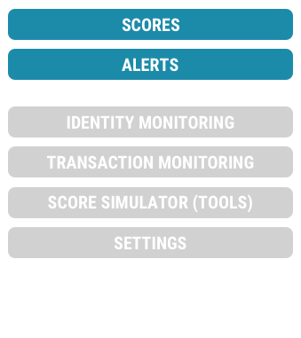
Our plan of attack aligned with our primary personas and actual user goals. We chose to focus primarily on Scores (ie. Credit) and Alerts. Scores was FICO's bread and butter, and Alerts were the second most visited page across all platforms.
In addition to a complete overhaul of Scores and Alerts, we needed to add Identity Monitoring product integration, Transaction Monitoring product integration, the popular and useful Score Simulator tool and design all of the settings natively. *phew*
From Discovery to Release

During the discovery stage, I worked closely with the Product Manager to address the problems, take inventory (products, data, features, visualizations, etc.), conduct internal and external competitive analysis of our platforms along with competitors, define requirements and formulate a plan of attack.
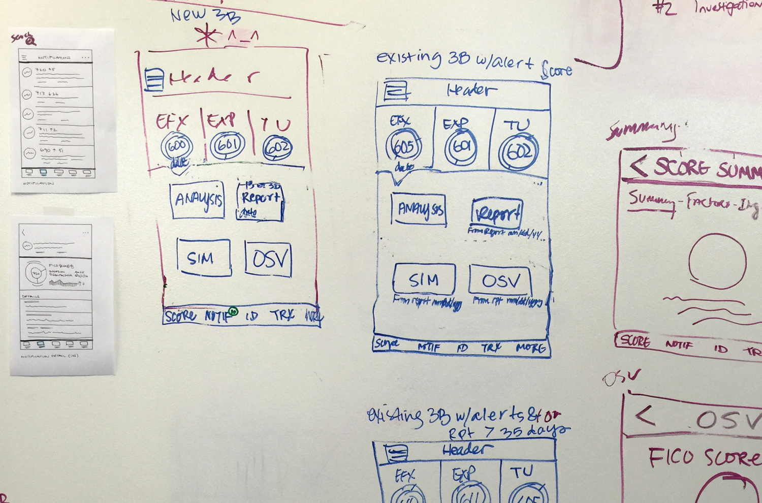
Sketches
Wireframes

Designs
Once a plan and priority list was generated, I was able to start the design process. It all starts with sketches and wireframes. In this case, we started to prototype early to user test early concepts. We conducted our first user test with wireframes — providing valuable information early on in the process. After we were confident in the direction, I started to develop high fidelity design comps, formulating style patterns, fonts, and colors using accurate data and visualizations.

Creating prototypes were essential for getting real hands on the product. I utilize InVision and Pixate to build the prototypes. InVision is a fast way to get designs on the device and simple interaction across a wide array of pages. Unfortunately, InVision lacks in dynamic micro interactions and animations. With Pixate, I was able to visualize animations and partial-page usability and really brought the app to life.


I created a 120+ page documentation consisting of branding, components, asset libraries, page flows, designs, styles, & interaction designs. This document provides a clear explanation of the design to the team. This helps designers with consistency, engineers with implementation, quality assurance with verification and the team as a whole better understand the product.
Finally, I worked hand in hand with developers — outlining the design and features, and supporting them with any questions that arose during the engineering stage.
The Birth of the Home Screen
During the early wireframes, we discovered that the Scores screen was not an ideal page to land the user on when logging in. Up to this point in time, users would always be presented with their Scores data in context of the Scores section.
With the introduction of the Identity Monitoring and Transaction monitoring product, FICO was no longer just credit data. I designed a Welcome screen that personalized the experience for the user. Display data pertaining to the user’s products, account and information. This new screen would catch the user up on changes to their account since last login and recommendations on actions to take. We created a matrix of all possible elements that we would want to display across the FICO product suite and prioritized the display of them based on importance. Only data that was relevant to the user would show.


Not only did this page have customized information, but also greeted the user and introduced a humanistic and emotional tone to the app with the Welcome-scape. The Welcome-scape displayed an active and animating scene scape that would change depending on the time of day you visited the app and greet you accordingly. There were different micro animations for each of the 3 scenes and a 3D elastic scroll effect to really bring it to life.

There was initial hesitation from stakeholders in the Welcome-scape with concern about the content of the real estate. So, naturally, we conducted a round of user testing. This test included tasks spanning the entire Welcome screen and elements of the credit data. The findings were surprising with 100% of the participants expressing their liking for the Welcome-scape — some stating that it sparked a positive emotion and feeling even though their credit data was less than perfect.
We kept the feature and now it’s one of the defining characteristics of the FICO product experience.

1 Bureau Data

3 Bureau Data
One IS GREATER THAN Three
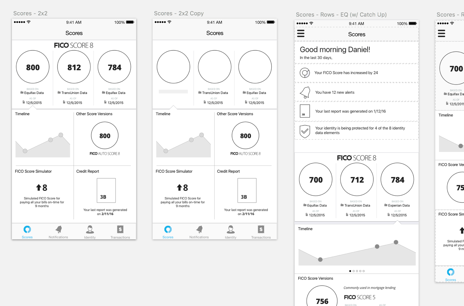
One of the hardest problems to solve during this redesign was the format of the credit data. Ultimately, there are 3 credit data bureaus with 3 sets of data that drive the FICO Score. Each set of data includes a multitude of factors, ingredients, and data. Traditionally, we’ve displayed 1 bureau at a time, especially on smaller viewports such as mobile.
Seeing as a 3 bureau comparable view was the golden key in credit display, I was determined to make this work. From wireframes to designs, I explored multiple solutions with both 3 bureau data side-by-side and 1 bureau data view. We extensively A/B tested both solutions and in the end, the 1 bureau data display had a higher comprehension rate (~95% vs 72%) and less overall confusion.
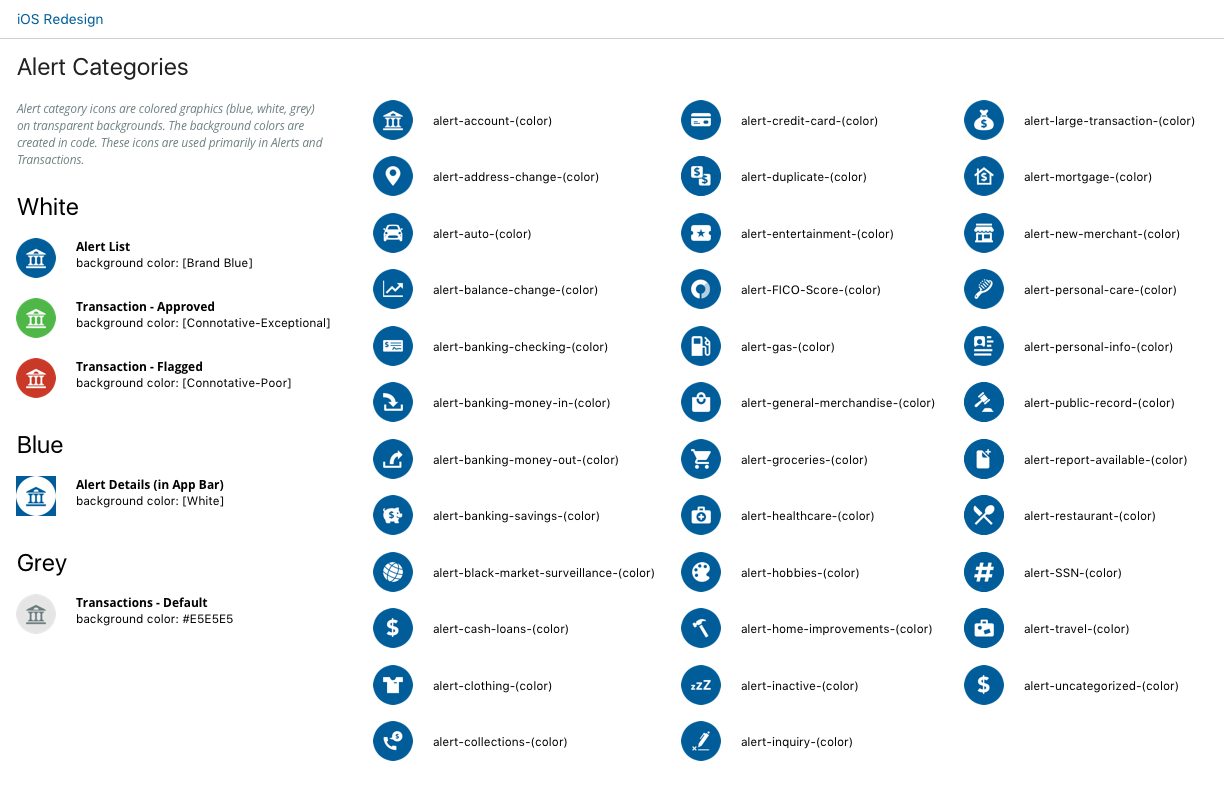
ALERTS!

Old Alert
Trailing the login page, Alerts were the next highest trafficked screen and the only other screen a user can enter the app other than the Welcome page.
In the old app, the Alerts were very dry and data heavy, provided no insights or follow up steps to aid the user. I redesigned the alerts display to add clarity, context and ultimately add value for the user.

I achieved this in 3 ways — explained clearly why the user received this alert, describe how it affected their credit, identity or transactional accounts, and provided next steps that helped explain, fix or mitigate a potential risk.
Multiple rounds of user testing proved this new data set and layout provided a clearer understanding of the alert, and increased user satisfaction and engagement!

